

Bridgerton: Unmasking Damask
Part II: Pattern as Ornament

As part of my work illustrating for Bridgerton consumer products, I developed three unique damask patterns, each designed to speak to different narratives within the brand universe. But in the interest of not overwhelming anyone (myself included), I’ll focus on just one here: the Core Bridgerton Damask.
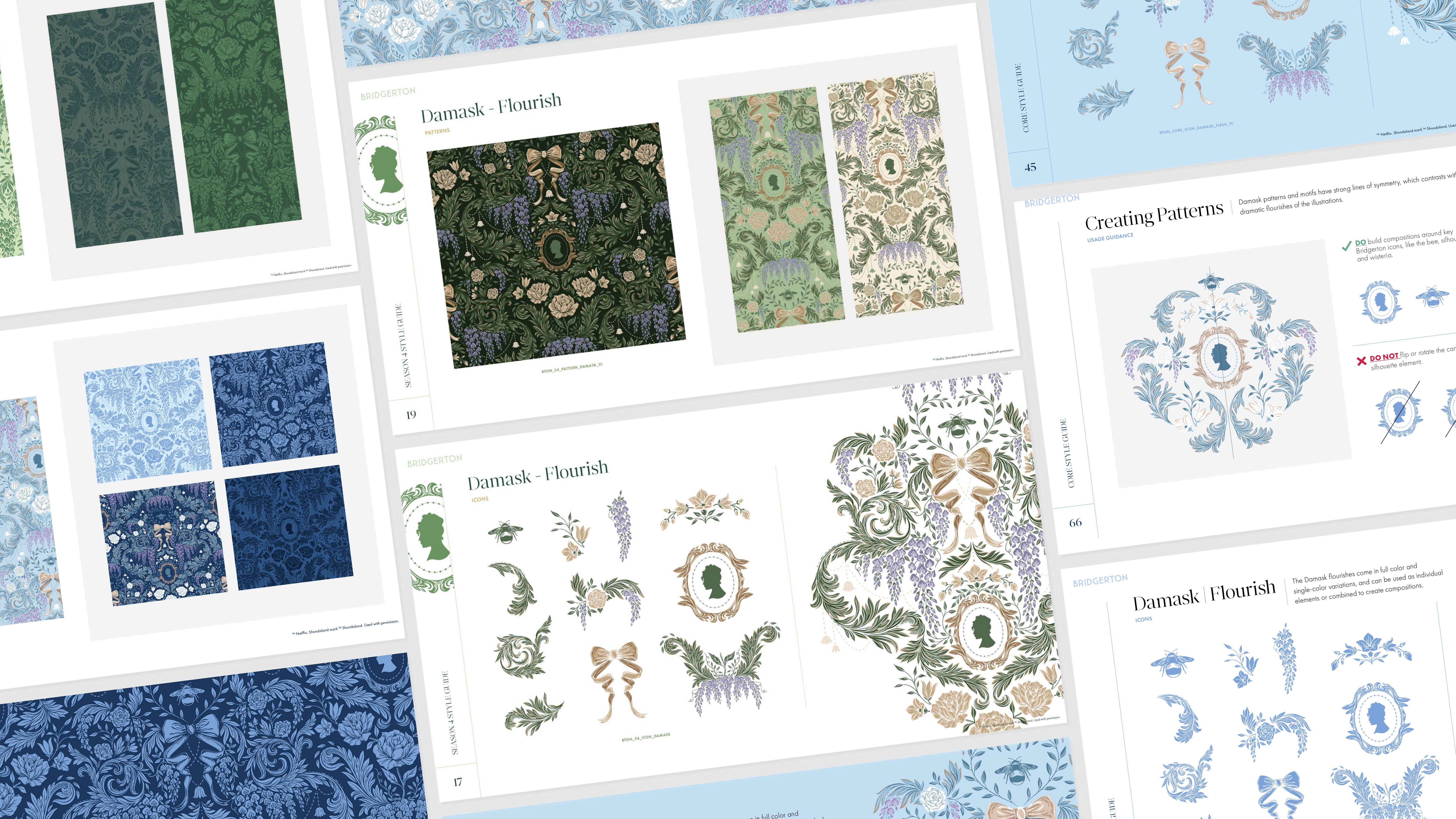
By the Regency era, damask had become a defining element of decorative arts, used widely across textiles and interiors. While I started my research using historically accurate sources, including The World of Ornament and The Book of Printed Fabrics (both by Taschen), my work wasn’t limited to directly referencing the past. That’s because Bridgerton lives in its own universe as a historical fantasy. Meaning: plenty of room to playfully interpret the brief.
That said, every decision had to serve the illustration system and, ultimately, the brand partners utilizing the artwork. Scale, texture, and color could shift, but always with adaptability in mind.
TL;DR: Structurally, rooted in tradition. Creatively, inspired by the fantastical world of Bridgerton. Practically, designed for real-world commercial applications.
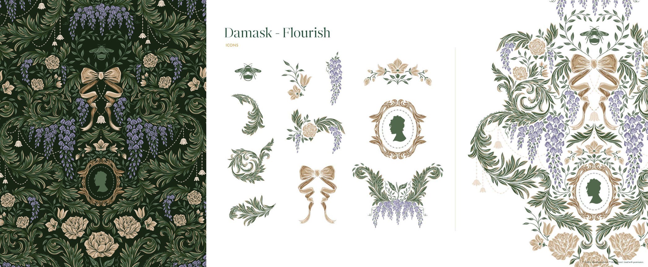
The damask pattern was built using a selection of icons and painterly filigree. I reworked the show’s Lady Whistledown silhouette, along with the *iconic* bee emblem. I wanted it to feel hand-drawn, with an artist’s touch. After retooling the pattern several times in different illustration styles, I knew the artwork would be best delivered in (gasp!)…vector.* Which left me with the design challenge of creating imperfections out of inherently smooth lines. Zoom in with me, will you?
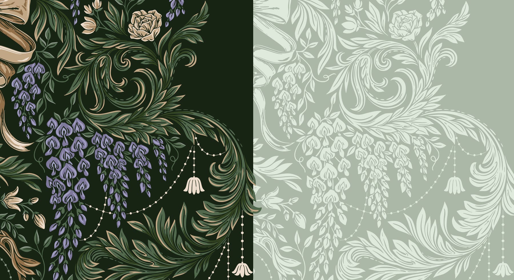
I landed on an illustrated vector style that was perfectly imperfect. The exteriors of each shape, leaf and blossom stayed crisp, while the interiors included brush-like strokes, holes and inconsistent overlaps. Modern up close, painterly at a distance.
*Back to vector (I know, I know). I was already working in a limited, flat palette, imagining that brand partners could easily swap in preferred colors for accent elements like roses, bows, and frames. At its smallest scale, I also wanted to ensure there would be no issues with line weights, especially in the case of specialty and inverse printing.
In a design like this, dropping the lines altogether and using the background color as the de facto linework ensures nothing gets lost or muddied and details can be scaled back if needed. To accommodate single-color printing or embossing, I simplified the pattern by including toggleable layers to drop all highlights and shadows. Brand partners had access to the full, editable pattern tile, along with an icon library in both full and 1-color.
Here’s where it gets fun. Case studies! Because this is all quite nice in practice, but what happens when those big brands get their hands on the artwork?
I thought you’d never ask…
Dove x Bridgerton, Limited-Edition Collection, 2026
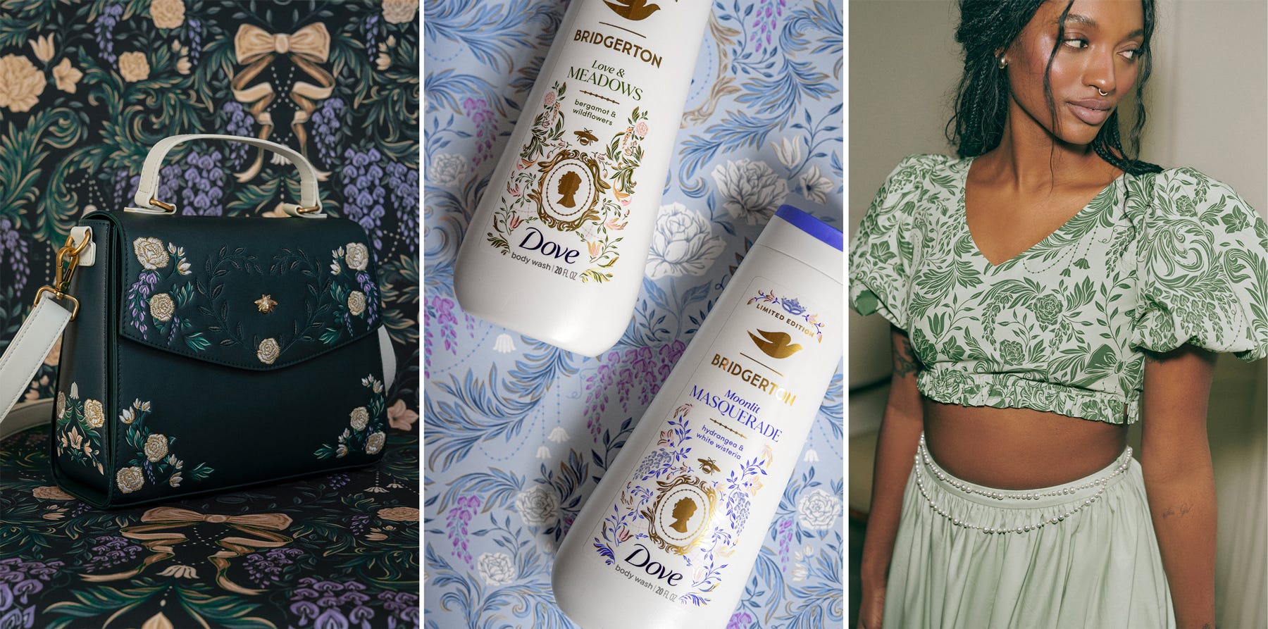
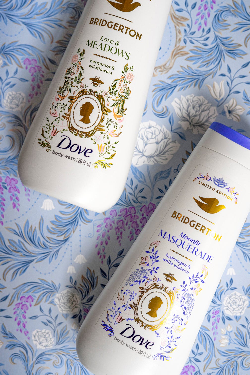
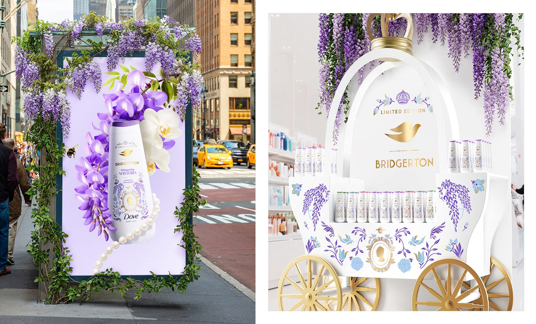
Dove rolled out the Let Them Talk limited-edition Bridgerton campaign ahead of the Season 4 premiere, and their agency partner JDO made full use of the artwork. The pattern was adapted in both layout and color to bring each of the four scents to life: Moonlit Masquerade, Whispering Wisteria, Love & Meadows, and Raspberry Rendezvous.
Subsections of the core artwork were pulled apart and recomposed into framing devices, wrapping around the newly-illustrated Lady Whistledown icon for each scent variant. The end result sits comfortably within Dove’s brand world, but with just enough Bridgerton romance layered in to make it feel distinctly special.

Loungefly x Bridgerton, Accessory Collection, 2026
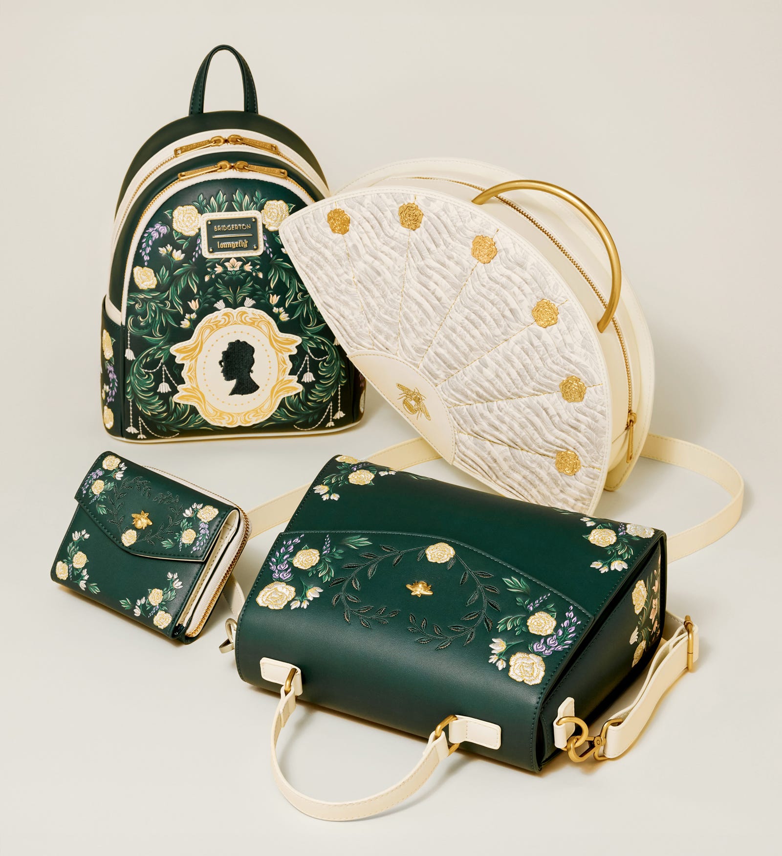
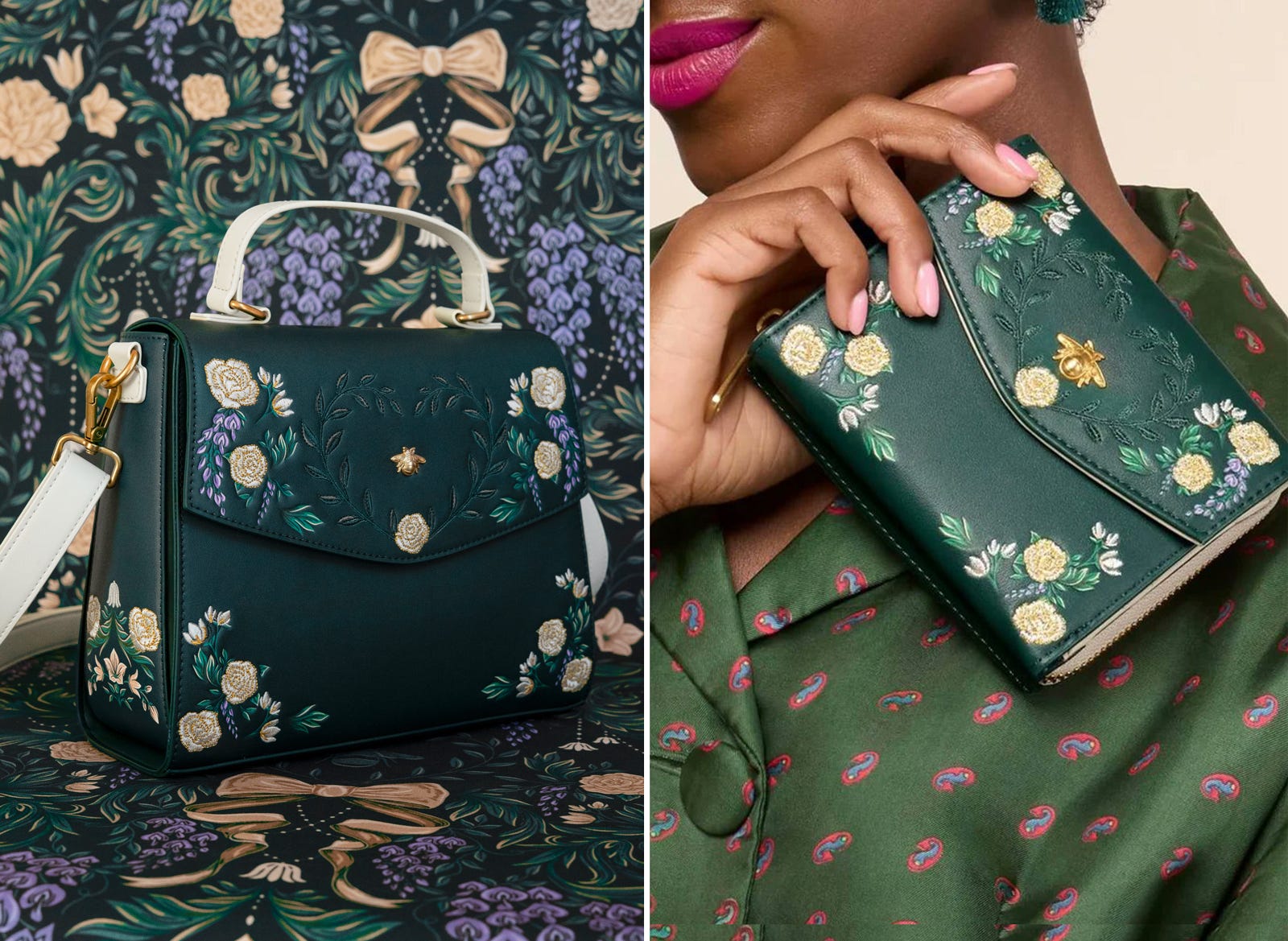
This application of the damask artwork made me so happy. For their limited-edition accessory collection, Loungefly adapted the pattern as embroidered detailing across bags, purses and wallets. One of my favorite uses: the bee and heart motif on the flap of the crossbody bag. Even more subtly, the pattern was used on the masquerade fan bag as a tone-on-tone fabric, layered beneath embroidered rose medallions pulled from the same design.
To me, this highlights the flexibility of the artwork so well. The same base pattern shifts from subtle texture to bold, decorative detailing. These bags don’t feel like co-branding to me, they feel like intentional Regencycore pieces that fit perfectly into the Bridgerton world.
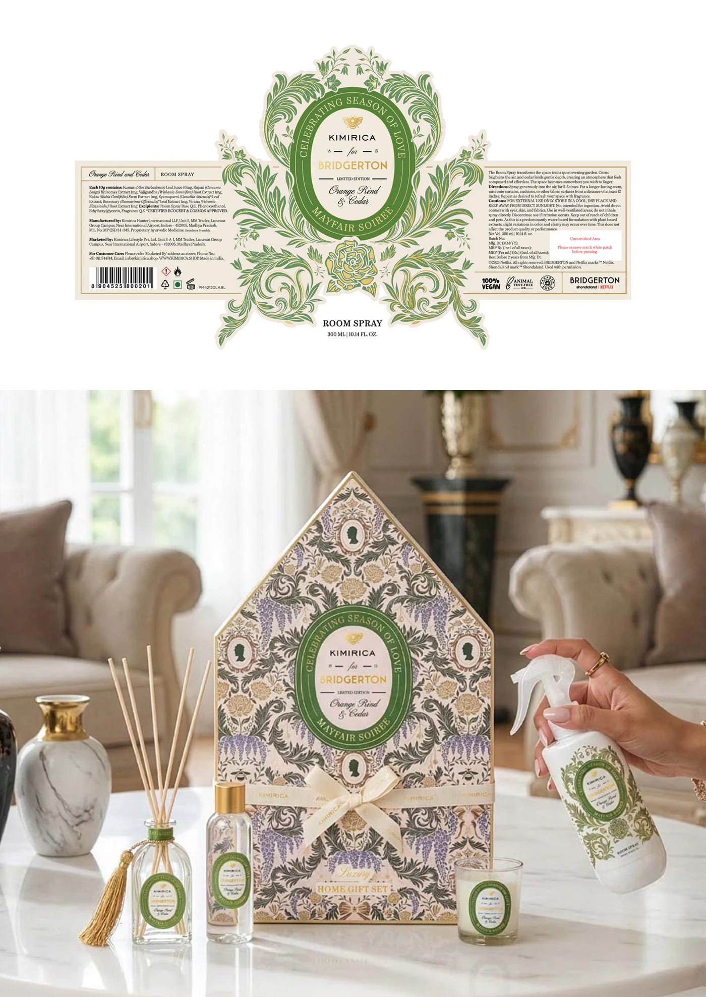
Kimirica x Bridgerton, Limited-Edition Luxury Fragrance Collection, 2026
Kimirica utilized several patterns across their full Bridgerton range, using different styles to anchor each of their themed collections. For the damask, they arranged the artwork into custom die-cut badging for standalone products, and used the full pattern across outer packaging in their Mayfair Soiree line.
When I saw Kimirica’s collection, I could immediately tell the designer had fun putting these compositions together. It reads as royal, elevated and intentional, and showcases the range of the artwork beautifully.
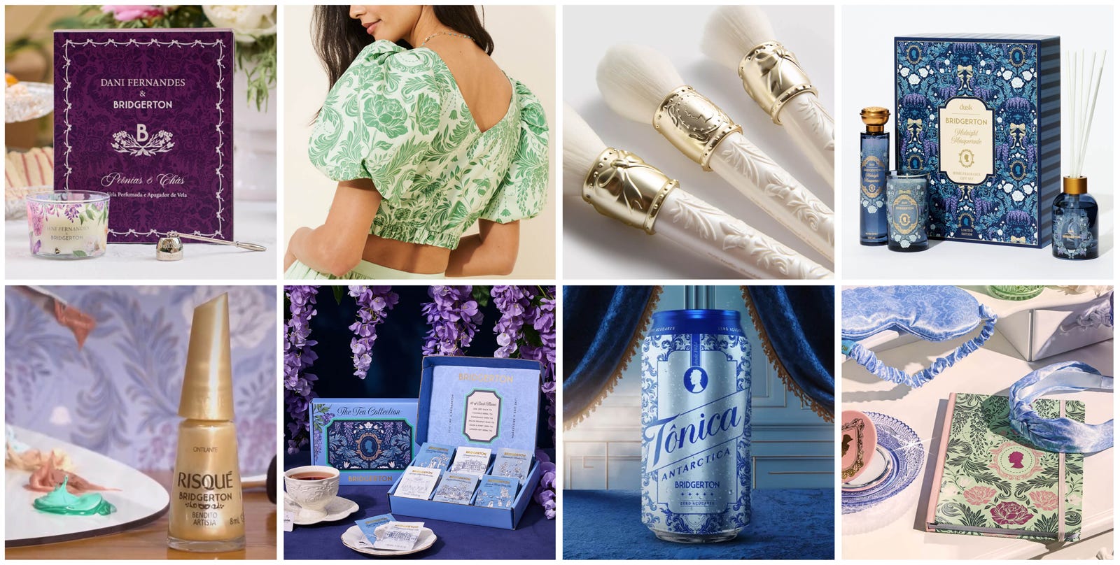
Of course, many other brand partners adapted the damask artwork to their own visual language, each one highlighting a different use of the same underlying system. I’m deeply grateful to each of them for seeing the potential of the work and for approaching it with such thoughtfulness.
As an artist, it’s a gift to see your work handled with that level of enthusiasm and attention to detail. I’ll share a broader sweep of some additional Bridgerton collaborations below in which the damask artwork shines.
Same system, beautifully unique outcomes.
Next, I’ll take a closer look at the remaining pattern styles I illustrated for the Bridgerton brand world. If there’s something specific you’d like to see, let me know.
Love from Mayfair,
Maggie
@littlepatterns
ABSOLUTELY ENTHRALLING PROCESS. This is a perfect case study.